Redesigning a leading green energy publication for engagement and usability
The client
RenewEconomy is one of Australia’s leading publications covering the renewable energy transition. With millions of readers visiting monthly, the website plays a crucial role in informing and educating the public on sustainable energy solutions. The goal of this project was to redesign the website’s UX/UI to create a more seamless and engaging experience for readers while supporting the site’s business objectives, such as ad revenue and audience retention.
How might we increase user retention and session times, without diminishing ad revenue?
This project aimed to tackle key challenges affecting user engagement and revenue generation on the website. The first challenge centered on improving user navigation on the website, fostering a more intuitive and engaging experience for visitors. The second goal of the project aimed to boost user retention, particularly on article pages, simultaneously increasing RenewEconomy's Although RenewEconomy attracted strong traffic, analytics revealed high bounce rates and low session durations, particularly on article pages. Users were struggling to navigate the site effectively and discover content that matched their interests. The challenge was to create a design that simplified navigation, encouraged users to explore more content, and improved overall engagement—all without compromising the existing revenue model or brand identity., aligning with the overarching objective of sustaining and growing the business’ financial health. By addressing these goals, RenewEconomy sought to create a more compelling and personalised user journey for its audience.
You’ve got to start with the customer {user} experience and work back toward the technology, not the other way around.
The redesign process began with a combination of quantitative and qualitative research. Google Analytics highlighted patterns in user behaviour, while user testing revealed frustration points around navigation, article layout, and content discoverability.
Based on these insights, several key solutions were implemented:
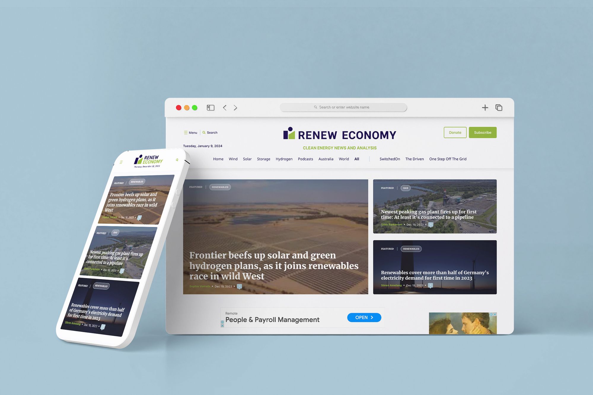
- Navigation overhaul: Menus were simplified and restructured to make it easier for users to find topics of interest.
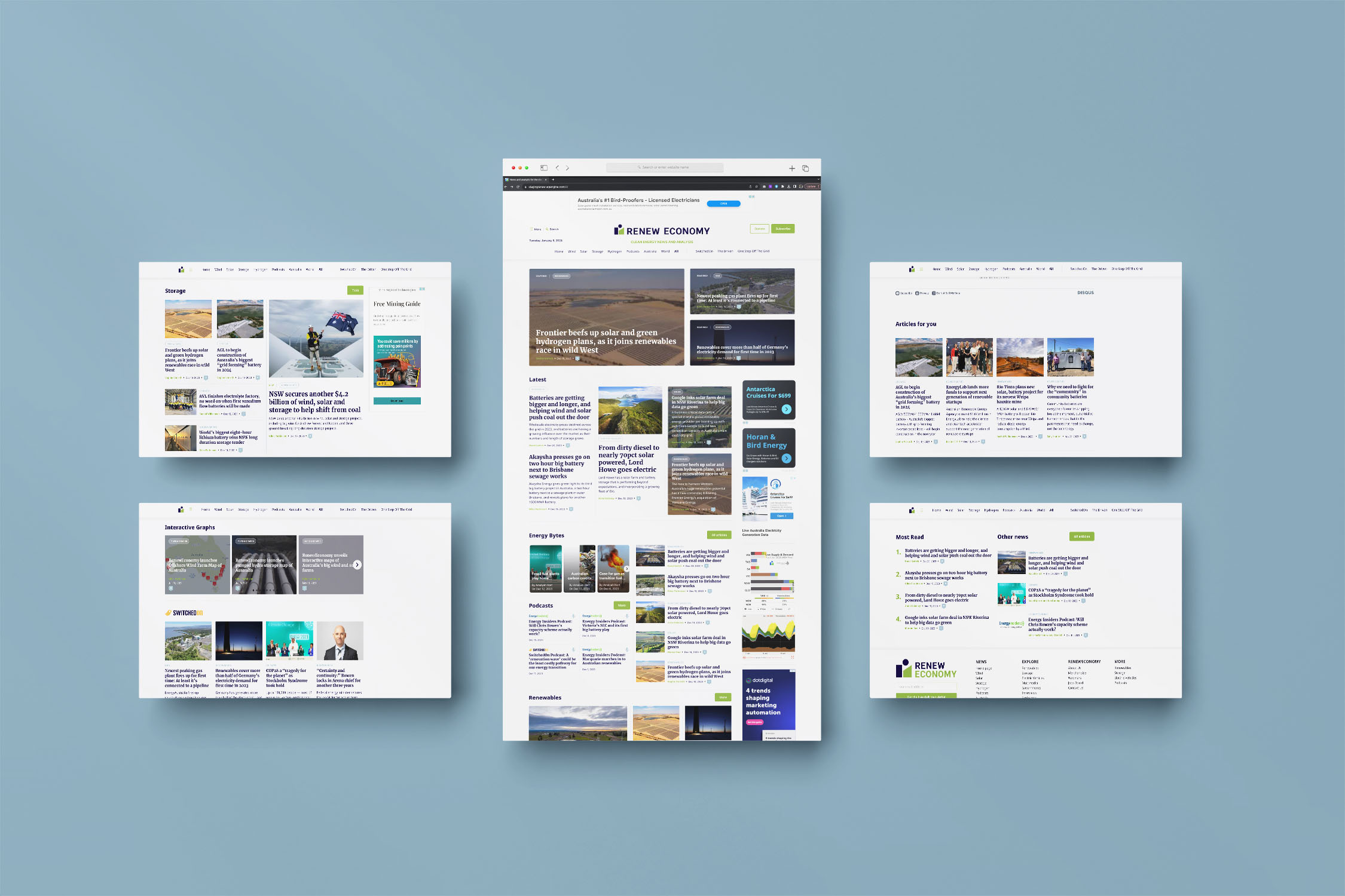
- Content hierarchy: A grid-based layout was introduced to visually prioritise important stories and create a clear flow between sections.
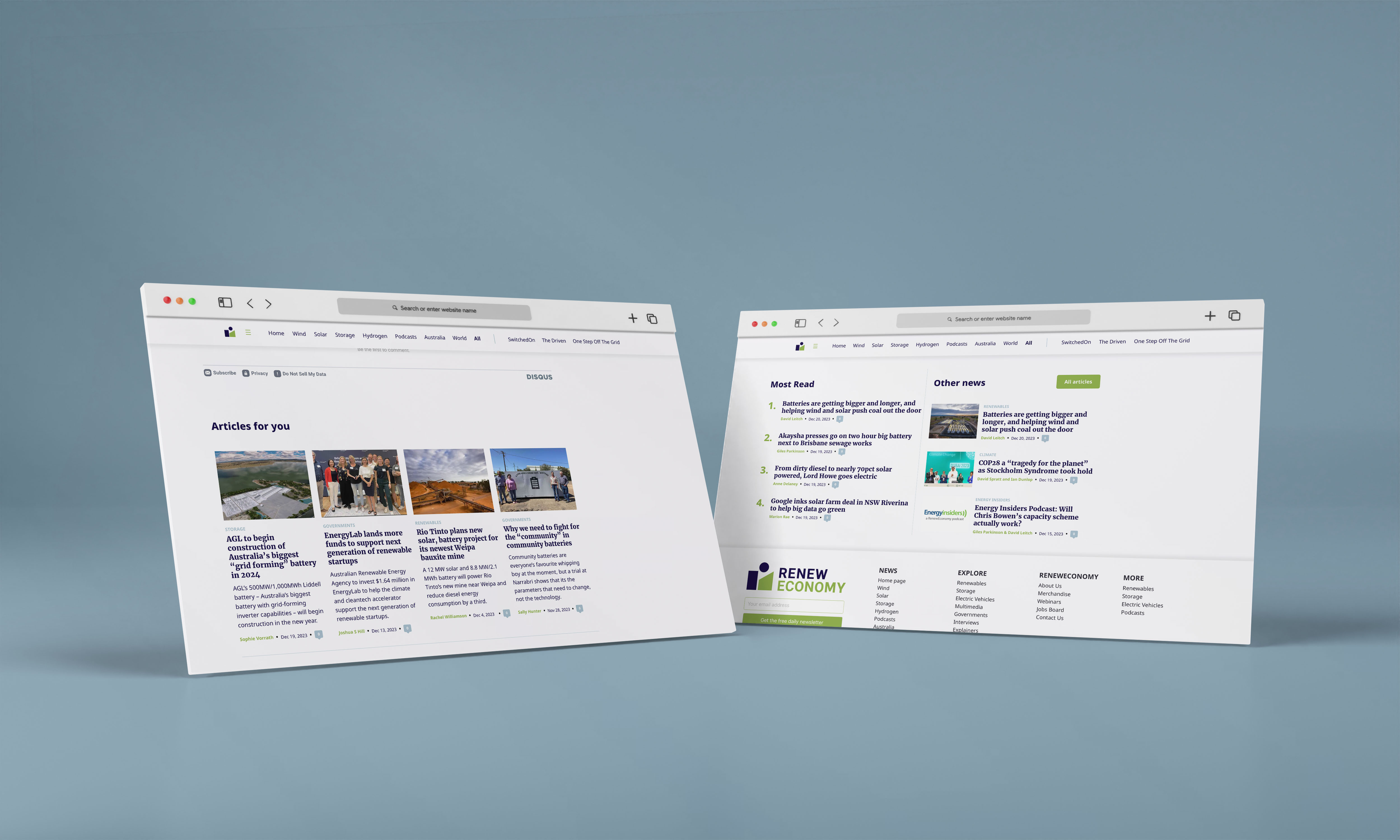
- Article layouts: Individual article pages were redesigned to improve readability, emphasise key information, and encourage further exploration.
- Personalised recommendations: Algorithms and UX patterns were added to suggest related articles, keeping readers engaged and increasing session time.
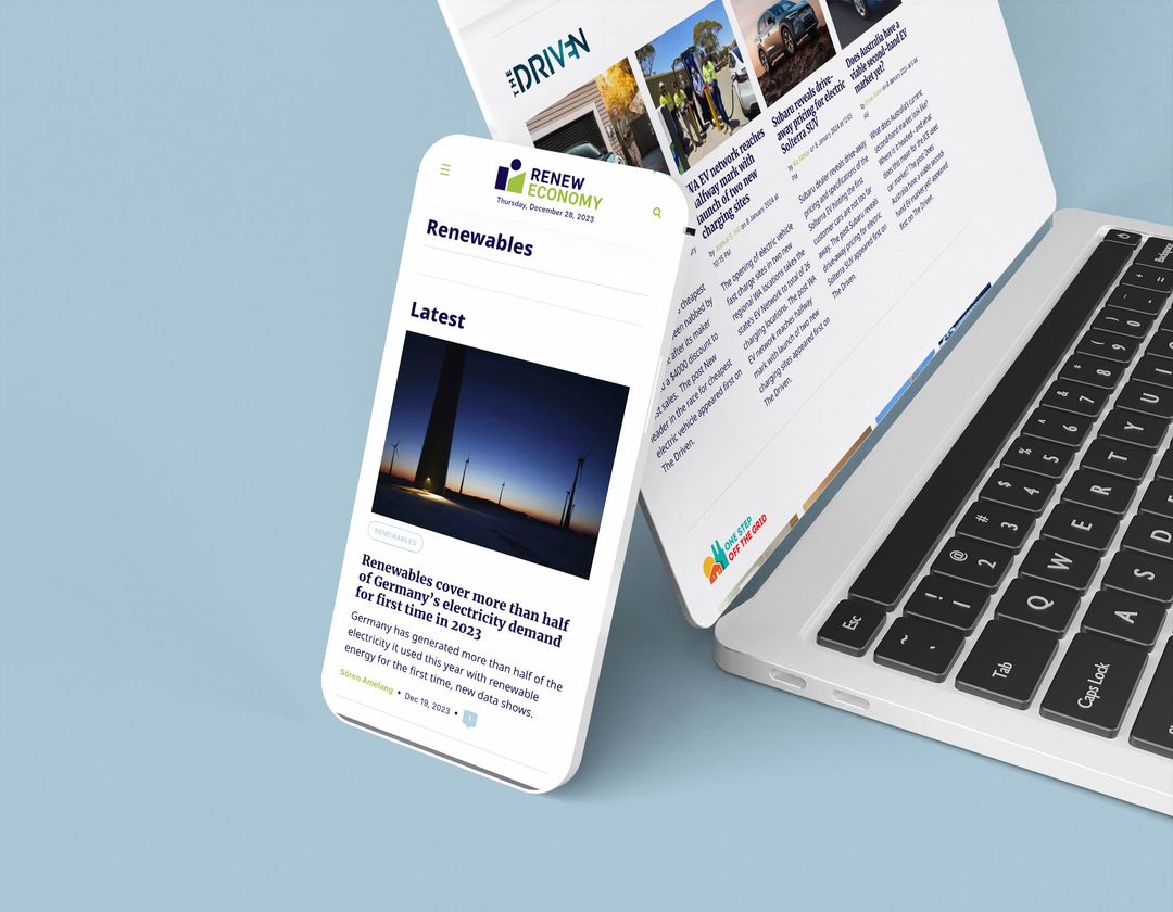
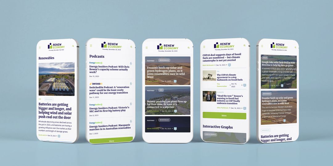
- Responsive design: Mobile and tablet experiences were refined to ensure accessibility and usability across devices.
The approach was iterative, with each design choice informed by user behaviour, analytics, and business goals to ensure a balance between user experience and commercial performance.
NB: this project was lead while our founder was employed at Sliced Bread Social
A User-Centred Experience
The final result is a fully redesigned, user-centred website that supports deeper engagement and more intuitive exploration of content. Key improvements include a streamlined navigation system, visually clear content hierarchies, and personalised article suggestions that encourage readers to spend more time on the site. Since launch, the redesign has created a more enjoyable and sustainable experience for both readers and the business, with ongoing analytics being monitored to inform future optimisations.